*Exemplar*: Moar Modifications
August 31, 2021 fun alpha mod medieval play-and-write play humans points scoring graphic design design accessibility revisions playtesting exemplar
Last week, I wrote about how much fun everyone had, seemed to have, or pretended to have, or seemed to pretend to have had playing Exemplar, the board game I’m designing around the practice and strategy of medieval manuscript compilation. Reviews were positive, and the majority of complaints were about accessibility and aesthetics, rather than core gameplay mechanics. (Apart from Lauren, of course, who is finding, as intended, that the Ruthless Lauren Approach will not work in every game. GOOD.)
Of course, I’m not a graphic designer: my artistic capacities are . . . limited, and my patience with even the most accommodating digitization programs almost nonexistent. It’s possible that I wouldn’t notice the difference if you took the artistic components out of every top 50 BGG game and just made them all black and white, arial 10, with thick borders. (Ok, I mean, I would notice but I wouldn’t care nearly as much as the next board-gamer: I’m the dummy complaining about how big the art is in Scythe encounters.) If I can read it and play it, it’s fine.
Anyway, this playtest round reminded me of a few things about normal humans who aren’t me, some of which I’m passing onto the graphic design squad of Sam and Lauren. First, many humans hate cursive/calligraphic fonts. If I had a nickel for every time someone said “what does that card say at the top?” I could buy, like, a candy bar in 1990 (but not today, ‘sup shrinkflation). Second, for many humans, a picture is worth a thousand words: a clear symbology is extremely helpful for players organizing information in a new gamespace. Third, for many humans, otiose information actively takes away from the game: right now, I have information on the cards pertaining to an aspect (end-game bonuses) that hasn’t been completed yet, and everyone found that very confusing.
There’s only so much I can to do solve these problems without a full reprint! I’m just not re-handwriting the title of each and every card! (Also, that would not make them more legible, oops.) But I made some adjustments on the fly that I think really help with playing the game, even if they don’t change mechanics or scoring.
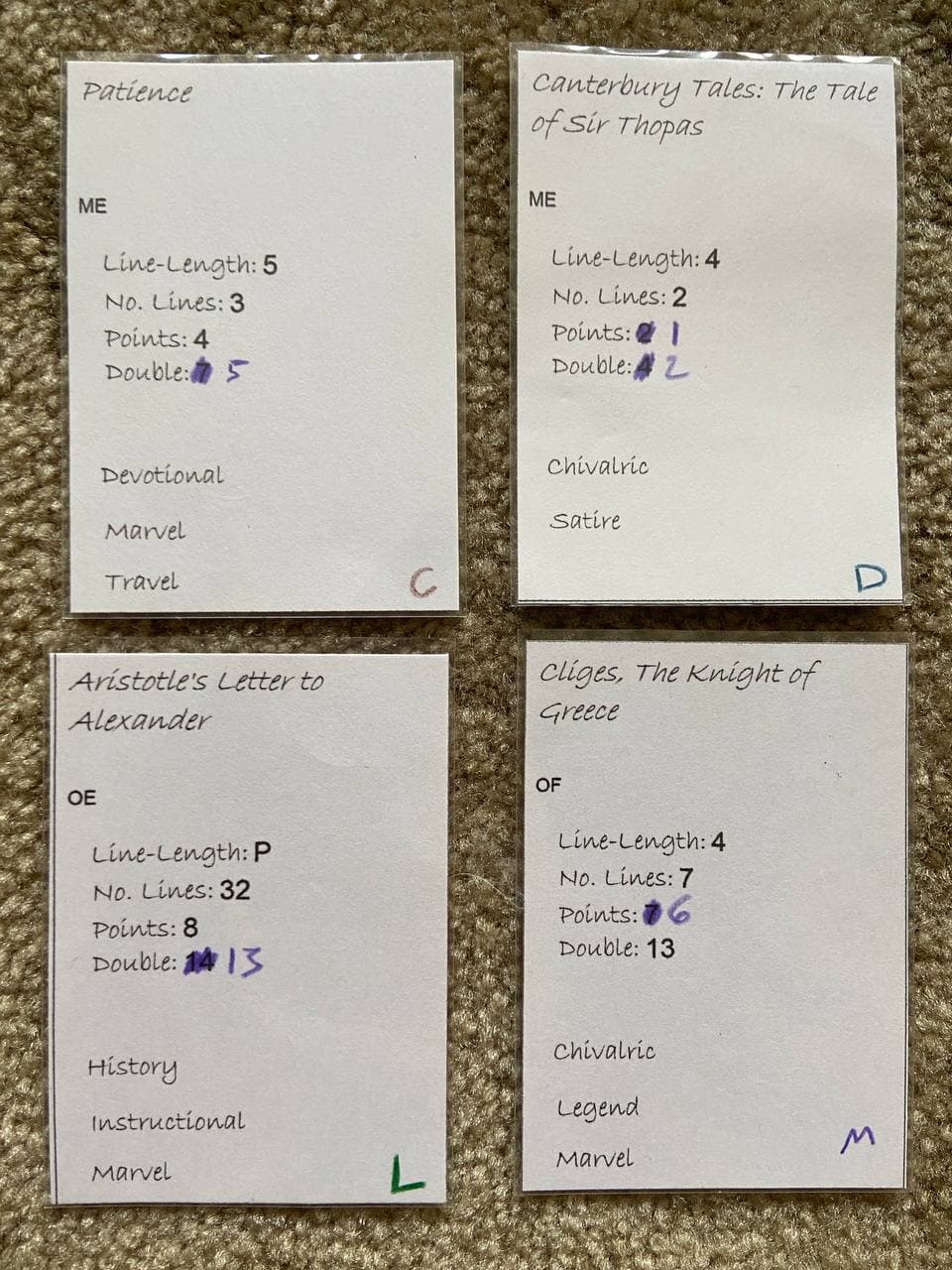
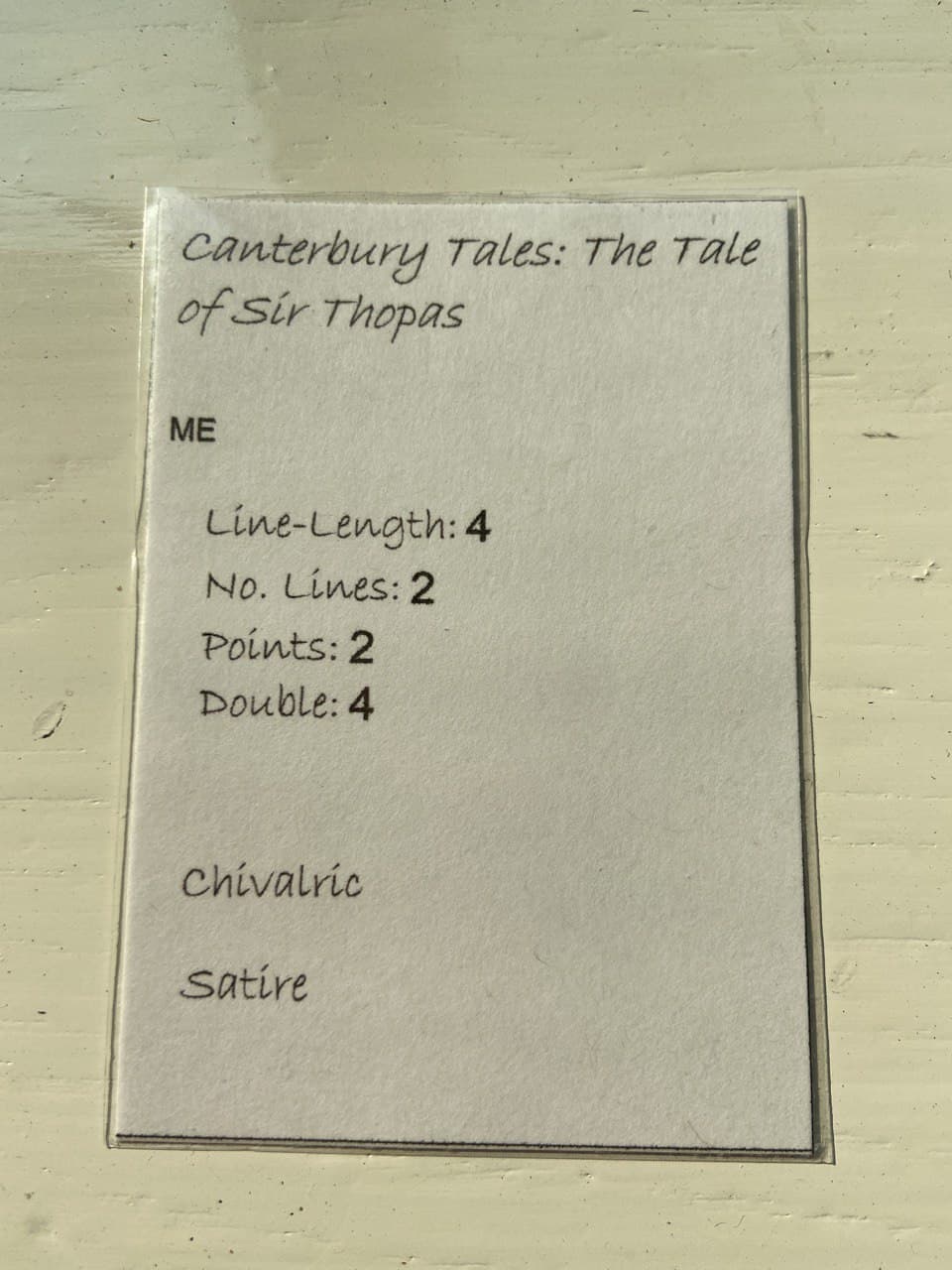
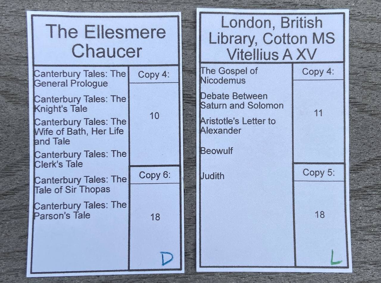
First, using colored pencils, I gave each Exemplar Card a color and symbol (in this case, letters of the alphabet), to distinguish it from other Exemplar Cards. I then placed matching colored symbols on each individual Text Card. For both kinds of card, the symbol can be found in the same location (bottom right, currently), so when a new Text is flipped up, you can tell at a glance what Exemplars it corresponds to. In the olden days, you had to read all the words, now you can just glance at the (not yet pretty) pictures.
I also, as you can see, re-scored a few of the cards to accommodate player feedback. On the one hand, I am very confident that I created a system that has balance and heft – the question is whether it’s fun. On the other, part of “balance” is that humans are not machines, and we are naturally attuned to certain perceptions of fairness, and not all good strategies are good meta-strategies during certain kinds of group think etc etc etc. So if you copy a 4x2 text and a 4x3 text, you get different amounts of points now no matter what, even though by all rights (i.e. a lovely formula for expected value that I spent a lot of time on) they should be about the same. What can I say, I’m an accommodating guy.
Can’t wait to hear what the next group of playtesters thinks of the improvements!
-- Tom